When I first started abstract painting I was totally lost on what it was that makes up a good abstract painting.
Through trial and error, I stumbled on some of the principles of art on my own and through studying them more deeply, I now have a greater understanding of how to make better abstract paintings by using them.
The principles of art that make a great abstract paintings are:
- Proportion – The scaling of objects.
- Contrast – Accenting differences.
- Balance – Equal visible weight.
- Movement – The impression of action.
- Rhythm – The repetition of elements.
- Emphasis – Makes focal points stand out.
- Harmony – A sense of cohesion.
Each of these principles will help us to produce visually harmonious works using the elements of art. Studying them is like studying the chords that make up good sounding music.
Just like with chords, there are tried and true methods that we can study and wield to our benefit to improve the quality of our results.
When you’re struggling for ideas or wondering what to do next use these principles to help guide you to the next step.
As we go through them you may begin to notice how the various principles overlap and intermingle with each other. It is difficult to achieve one without also achieving some of the others too.
Related Articles:
- 17 Abstract Artists On Instagram That Will Inspire Your Art
- Abstract Art Projects To Try
- How To Do an Acrylic Pour
- How To Paint a Rose Abstract Style (Easy Step by Step)
- Making Abstract Geometric Art For Beginners
Proportion
Proportion is the use of two or more elements in a design and how they compare to each other.
When it comes to drawing people or animals you may often hear something like “Wow you’re really good at that but the nose looks just a bit out of proportion.” Maybe some other part of the whole doesn’t look right and is pointed out.
Often times this is because the proportions are off.
Another thing that proportion is used for is to make an object appear larger than it actually is. In photography or the film industry this trick is used to make people look like giants next to regular sized objects.
In paintings and drawings it can be used to emphasize an object or shape by making it larger than normal. When thinking about images like this it is easy to get a sense of proportion and how to use it.
When talking about abstract works though it becomes a bit more challenging to get a hold of. We can experiment with proportions in our abstract works in a few ways though.
Compositional proportion is something to always consider when working abstractly. Understanding the various ways to divide your canvas will help you understand where you want your focal points to be.
Having a sense of good proportions will equip you to create harmonious paintings.
The scaling of particular shapes and elements into different proportions as well is a good way to add a bit of this principle into our paintings.
Contrast
Contrast is the principle of bringing opposing elements together to accentuate their differences. When done correctly this principle can be used to guide the viewer’s attention through your painting.
Drawing your viewers attention to a specific area is easy when you make it stand out by applying contrasting colors.
Complementary colors are a great way to experiment with contrast. These are any two colors on the color wheel directly across from one another.
Of course, there are many other ways to create contrast with color through the use of differing values, hues, and saturation. This would be things like light vs dark, saturated vs muted, or warm vs cold.
Beyond color, we can create contrast with textures. Textures are especially useful in abstract painting. Varying between rough and smooth surfaces can bring depth and diversity to your abstract works.
This isn’t just in reference to the textures you might create on your canvas in an abstract work though. This can also be in reference to creating an image that has something soft contrasted with something hard.
Like say…a still life of a fluffy cat on a hard table.
You can create contrast with the use of space as well. Positive and negative space deployed strategically will create this opposing effect. The use of space is actually one of the principles sometimes cited so we will dive into more depth on it further down the page.
Another way to create contrast in your works is through geometry and line work. Fat lines vs thin lines, darker cross-hatching vs lighter cross-hatching, smooth lines vs jagged, etc.
There are many ways to add contrast to your works and direct the attention of your viewers to the focal points of importance.
Balance
The principle of balance refers to the creation of visual stability in your artwork. It’s the concept of visual weight and the distribution of elements in a way that brings order to the image.
We can think about and create balance in a few different ways. Symmetry is a great place to start as it’s one we are all familiar with.
Symmetry is everywhere in life and easy to understand. You can use symmetry to create an image that is the same on both sides of it’s axis.
The axis is the dividing line between the two sides and can be at any angle you want. While a vertical and horizontal axis are more common keep in mind you could make it diagonal in any degree you want too.
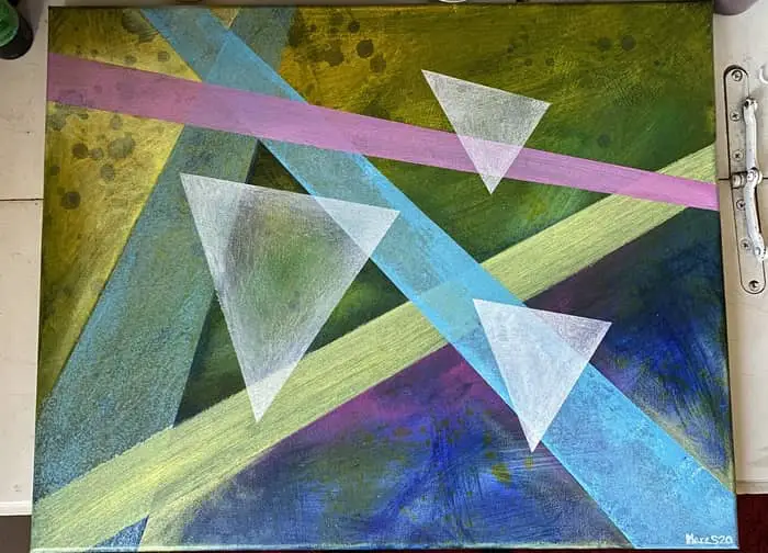
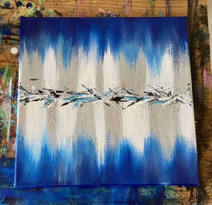
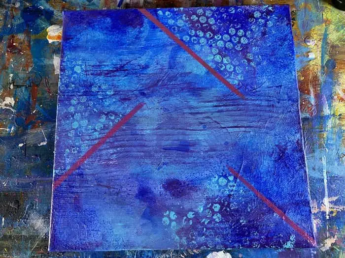
When it comes to symmetry there is this thing called approximate symmetry. This is used quite often by artists who want a sense of balance and symmetry but don’t want their image to be a mirror reflection of itself on either side of the axis.
Approximate symmetry is when you change minor elements to create more variety and diversity in your image. This is the sort of symmetry you see in the painting above.
Radial symmetry is another form of symmetry that calls for a central point of your image that all your elements are gravitating around.
Great examples of radial symmetry in nature include starfish, flowers, and snowflakes.
Mandala art is often based on radial symmetry and an easy way to see how it can be applied to art.
The last type of symmetry is asymmetry. It is similar to approximate symmetry in that we still want equal visual weight on both sides of the axis but they are not mirrored in any way.
Movement
The principle of movement doesn’t just refer to the artists ability to draw the viewer’s eye around the painting but also the impression of action in a work of art.
This sense of movement and action can be created in a number of ways.
The principle of rhythm can be used to bring a sense of movement into your painting. We will go into more depth on that in the next section.
Other than the use of rhythm, we can seek to create movement in our works with lines or even implied lines.
Horizontal and vertical lines bring a feeling of solidity. The are static and stable. When you look around at the world we are living in we see straight rigid lines everywhere on all sorts of objects that are at rest.
Dynamic lines on the other hand are much better at illustrating movement.
This is something that can often be seen in a drawing of a person who is moving. The use of dynamic lines can help to show the path of the movement the person is making.
It could be an image of them jogging down the sidewalk with lines behind them illustrating the direction they came from.
Movement can also be created through the use of implication as well. Going back to the example of a person running, even without the lines illustrating a persons path, the viewer should still be able to discern the movement of running based on the persons posture and bodily gestures.
Beyond the use of implication, we can also use colors too. This particular aspect of movement is much more useful in abstract painting.
According to the Virtual Instructor over at the virtualinstructor.com:
Color notes are sometimes described as high or low. A high key color is both light in value and strong in intensity while a low key color is both dark and dull.
Ashley Hurst from the Virtual Instructor
Using such variation in colors and dynamic lines can bring a sense of movement to an abstract work that doesn’t really have a subject that is meant to be moving.
Rhythm
The principle of rhythm in art is perhaps one of the hardest principles to understand and wrap your mind around.
The simplest way I can put it is that rhythm in art is the repetition of certain elements and the spacing between those repetitions. Many refer to it as creating an underlying beat or tempo in the image.
It is sort of a combination of the principles of movement and pattern in that we are using the repetition of elements in a pattern in such a way that it draws the viewer’s attention around or through the work of art.
Just like in music, the steady repetition of an element can bring a sense of cohesion to your image. You can place elements in places of your image that interrupt the rhythm you have created to bring a sense of contrast and emphasis to the picture.
There are two types of rhythms you can create. There is irregular rhythm, which feels natural in a sense that it isn’t too organized. It is organized enough to discern some type of consistent pattern and spacing yet not a perfect replication of the same pattern.
This concept makes me think of music notes that hold for 1/4 a measure vs 3/4 of a measure. So translating to an image perhaps you have a picket fence creating a regular sense of rhythm but maybe there are some pieces of the fence missing here and there.
Then there is regular rhythm. This would be more comparable to the steady beat of a drum where you have an equal thump on each quarter of the measure.
Translated to an image this would be more like a perfect picket fence with no pieces of the fence missing and all evenly spaced apart.
Emphasis
The principle of emphasis is used to make the focal points of your image stand out. You may have multiple points of interest which can all be emphasized in a variety of ways to direct your viewer’s attention to the subjects you want them to pay attention to.
We can create emphasis in these subjects through the use of colors and textures.
When it comes to color emphasis can be created through variation in value and saturation. Complementary colors, for example, are an excellent way to bring emphasis to a composition.
The principles of emphasis and contrast go hand in hand. You can create the desired emphasis by using contrasting colors and values.
Alternatively, there is the concept of isolated color. This would where the object of interest is of a color that just doesn’t fit with the rest of the color palette. This, of course, causes the object to stand out.
Another way to use color is called absent color. This would be something like an image where everything is black and white except the object of interest. This would be the only thing with color in the entire image instantly drawing our attention to it.
Emphasis can also be created through a variety of other methods not related to color.
One method you can use is convergence. Convergence is the use of lines or even implied lines to direct the viewer’s attention to where the object of focus is.
Another technique is the level of rendering you use. Think of this as like the focus on a camera.
You want your subject of interest to be the most in focus thing in the image while everything else is loose and blurry.
Then there is the use of the unique and unusual. This would be the use of something that is just totally out of place. Such out of place elements immediately grab our attention.
Harmony
The principle of harmony is when the elements of art are used to bring an overall sense of cohesion to the image.
This can be done in a few ways. Once again color can be used to gain a sense of harmony. This is probably why we call them color harmonies.
Analogous, complementary, split complementary, triadic, and tetradic color schemes are all ways to bring a sense of harmony to your painting.
Harmony can also be created through brush strokes and textures. This is easily seen in the works of palette knife artists in the textures and loose forms created using a palette knife.
Shapes, angles, and curves are also another way to bring harmony. If you have a painting with lots of sharp angles and throw something round or curved into it this can make it feel a bit less harmonious.
So stick with similar sharp angled shapes to keep it more harmonious.
Variety
Variety is the principle of art that will help bring more interest and spice into your paintings.
Closely tied with contrast and emphasis, which are principles often used to incorporate more variety, this principle will help to ensure your painting is boring.
In a sense, variety is the opposite of harmony. Just like we were talking about the importance of putting curved elements with other curved elements, to add variety, we would want to create a bit of discord by throwing in some angular elements into our curvy compositions.
It is, just like with contrast, the juxtaposition of opposing elements. Variety works in unison with your harmonious elements to bring intrigue into your painting.
Just like with all the other principles we use a number of techniques to create variety.
Colors, lines, brushwork, and shapes are all ways to add interest and variety into your work.
Unity
The principle of unity should be relatively simple to understand. It is when all of our elements and principles combine to create a cohesive image.
It is a combination of harmony, variety, rhythm, and movement that brings a sense of balance and completeness to the painting.
When all of these different things combine together in a balanced way your painting will have achieved a sense of unity.
There three additional methods one can use to apply a sense of unity.
The first is simplicity. This can be used in a number of ways but the idea is to reduce variety and complexity.
This could be done by simplifying your color palette or not using any colors at all.
The second is repetition. This goes back to the principle of rhythm and even patterns. The repetition of a particular element, shape, or color can help to drive unity into your painting.
The third is proximity. This refers to the elimination of negative space and placing the parts of your image so close together the viewer sees them as a whole instead of their individual parts.
By understanding how all of these principles ebb and flow with each other we can utilize them to make amazing abstract works of art! When it comes to what makes a great abstract painting it is these fundamental principles that will help guide us in our creative endeavors.
